
Posted At: Mar 19, 2026 - 448 Views
Exploring Board Game Artwork: A Complete Guide to Every Art Style That Makes Games Unforgettable
If you’ve ever picked up a board game purely because the box art caught your attention, you already understand the power of board game artwork. Before a single rule is read, before a single die is rolled, the art has already done its job. It’s pulled you in.
Great board game artwork isn’t decoration. It’s a design and marketing decision. It sets the tone, communicates the theme, attracts the right audience, and keeps players immersed in the world you’ve built.
Every style in this guide is one our studio has designed and delivered. We’re breaking down six major board game artwork styles, what makes each one work, when to use it, and what it communicates to the player before the first card is ever drawn.
Table of Contents
1. Character Concept Art
2. Painterly Fantasy Realism
3. Epic Cinematic Illustration
4. Vibrant Cartoon Art
5. Character-Driven Narrative Art
6. Anime & Action Art
1. Character Concept Art: Defining the Heroes (and Villains) of Your World
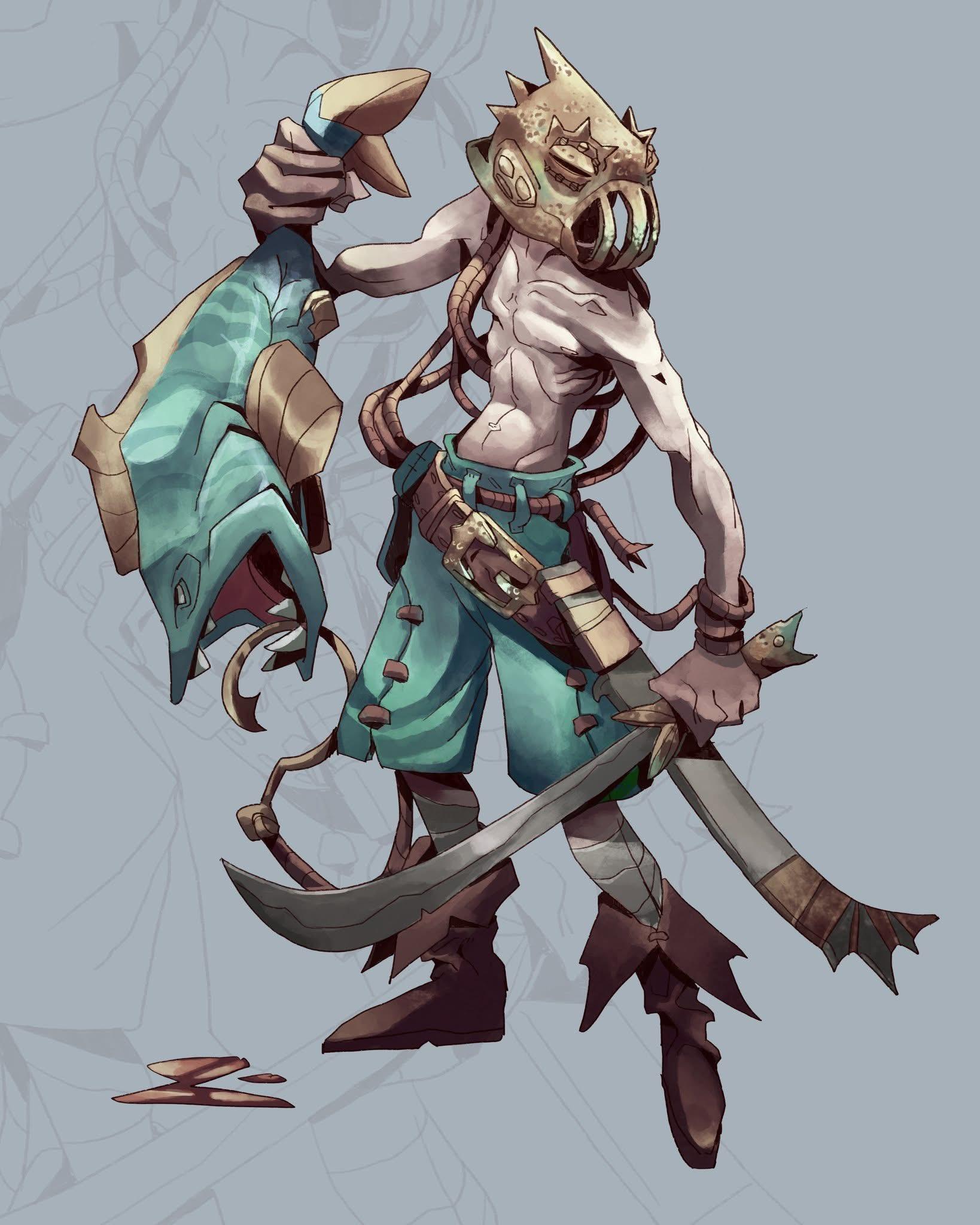
Walk into any board game café and you’ll notice something: the games people reach for first are almost always the ones with striking character art on the box. That’s not an accident, it’s character concept art doing exactly what it was designed to do.
Character concept art refers to fully illustrated, standalone character depictions, typically showing the whole figure, their equipment, costume, and personality all at once. It’s the style you see on character cards, miniature reference sheets, and hero dashboards.
Take the fish-skull-masked warrior above. Everything about that illustration tells a story without a single word. The teal silk wraps, the curved blade, the tentacle-like dreadlocks, the webbed feet, this is clearly a coastal raider, something between a humanoid and a sea creature. The neutral grey backdrop throws the character into sharp relief. That’s a deliberate choice: concept art needs to be readable above all else.
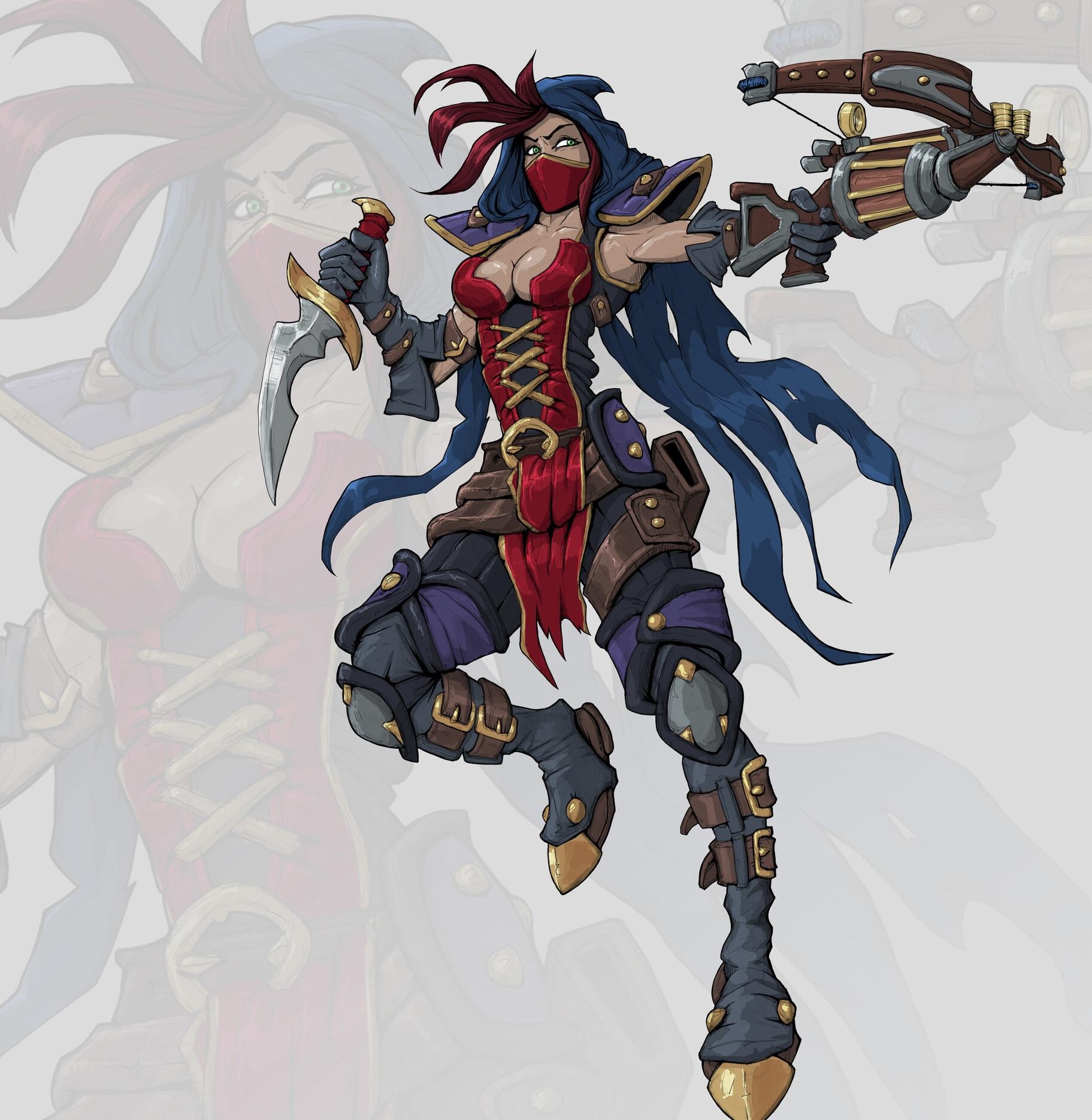
Compare that with the masked female rogue, blue hair streaming behind her, red corset, a mechanical crossbow in one hand and a curved dagger in the other. She’s mid-pose, full of momentum. You know her archetype immediately: fast, roguish, dangerous, probably sarcastic. The illustration has the clean line-work and bold color blocking of Western fantasy game art, where clarity of silhouette is prioritized over realism.
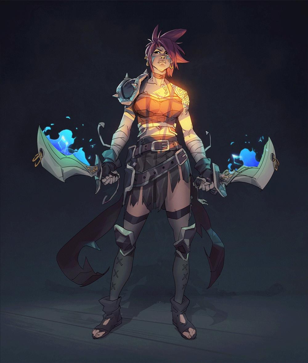
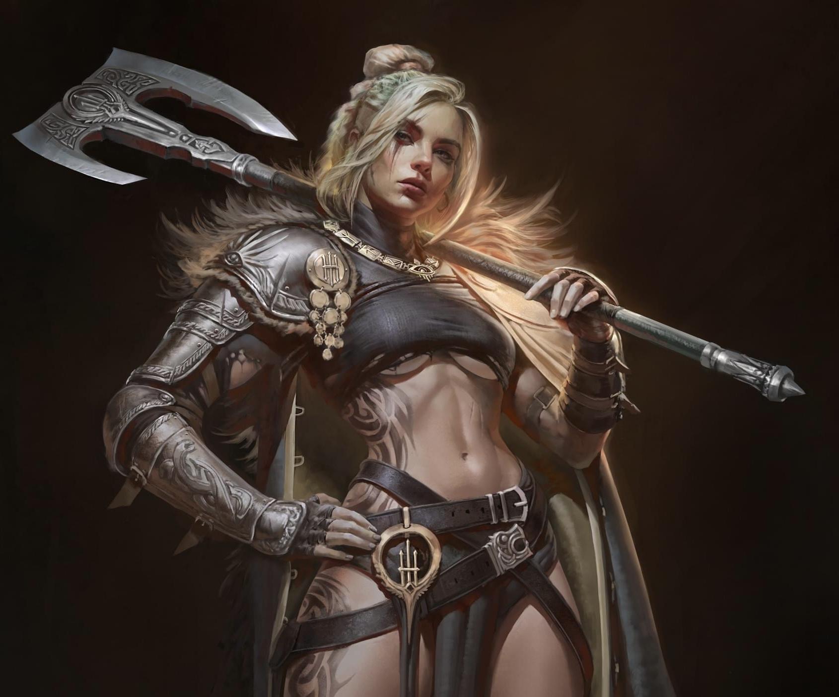
The dual-axe warrior with glowing runic tattoos and storm-blue enchanted weapons leans into a MOBA-adjacent aesthetic, dramatic under-lighting that makes her feel powerful rather than approachable. And the heavily-armored viking barbarian rounds out the spectrum: thick, fur-wrapped, comically intimidating, with just enough exaggeration to give him personality alongside power.
Why it works: When you’re choosing a hero to play as, you’re choosing an identity. The art is doing the persuading.
Best for: Character-based games, deck-builders, dungeon crawlers, miniature games, RPG hybrids.
What it communicates: “This game has depth. There are real characters here with stories to tell.”
2. Painterly Fantasy Realism: When the Canvas Comes Alive
Some board game artwork doesn’t want to look like a game. It wants to look like a painting hanging in a gallery. Painterly fantasy realism sits at the intersection of oil painting tradition and digital illustration tools, and when it’s done right, it’s breathtaking.
This style is defined by loose, expressive brushwork, nuanced lighting, and a sense of atmosphere that more polished digital styles can’t replicate. The colours are richer, the shadows deeper, and the figures feel grounded in their environments in a way that pure concept art often doesn’t.
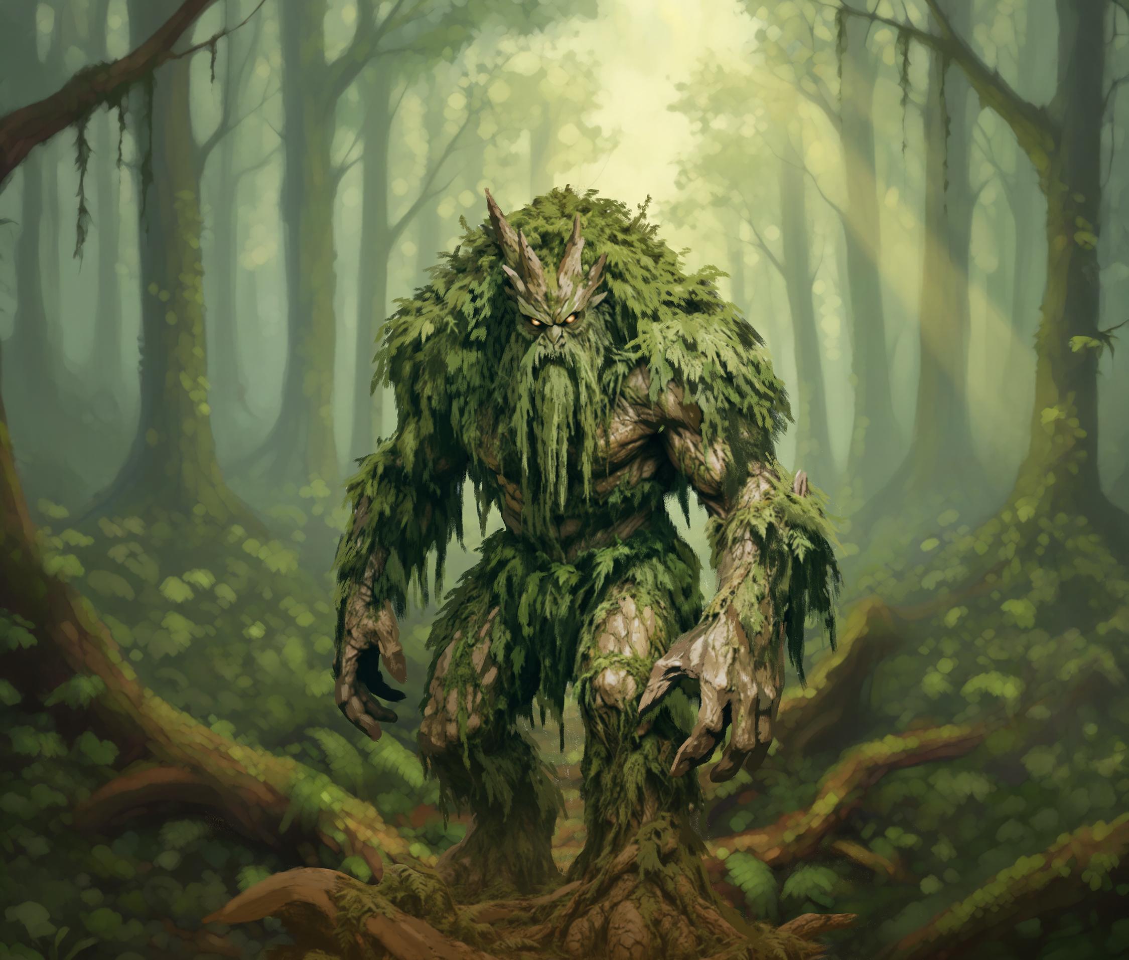
The above forest treant is a masterclass in this approach. Covered in leaves, moss, and bark, looming out of a misty woodland with glowing amber eyes, the painting style makes him feel organic rather than illustrated. The soft layered greens of the background bleed into his form. He belongs there. That environmental integration is something painterly realism achieves better than any other style.
The viking shieldmaiden pushed toward the photorealistic end tells a different story. The skin texture, the intricate engravings on her armor, the strands of hair catching the backlight, this is closer to digital oil painting than illustration. Games that commission art like this are making a statement: this world is serious, lived-in, and real.
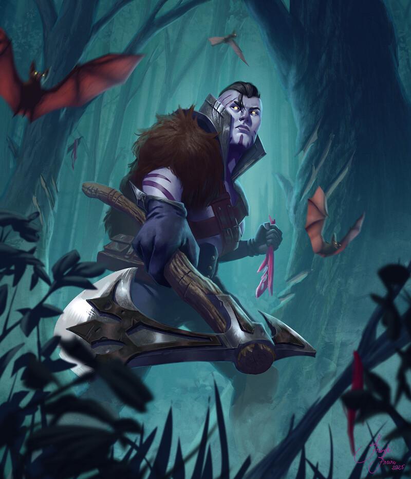
The blue-skinned dark elf rogue shifts the mood again, crouching in a luminous teal forest, bats circling overhead. The technique here is looser and impressionistic, the background trees suggested rather than rendered. This is painterly realism in service of atmosphere rather than detail.
Why it works: Painterly styles carry emotional weight. They feel handmade. There’s a warmth and imperfection to brushwork that digital polish sometimes loses.
Best for: Historical war games, dark fantasy titles, narrative adventure games, collector’s edition box art.
What it communicates: “This is a serious, atmospheric experience with real artistic ambition.”
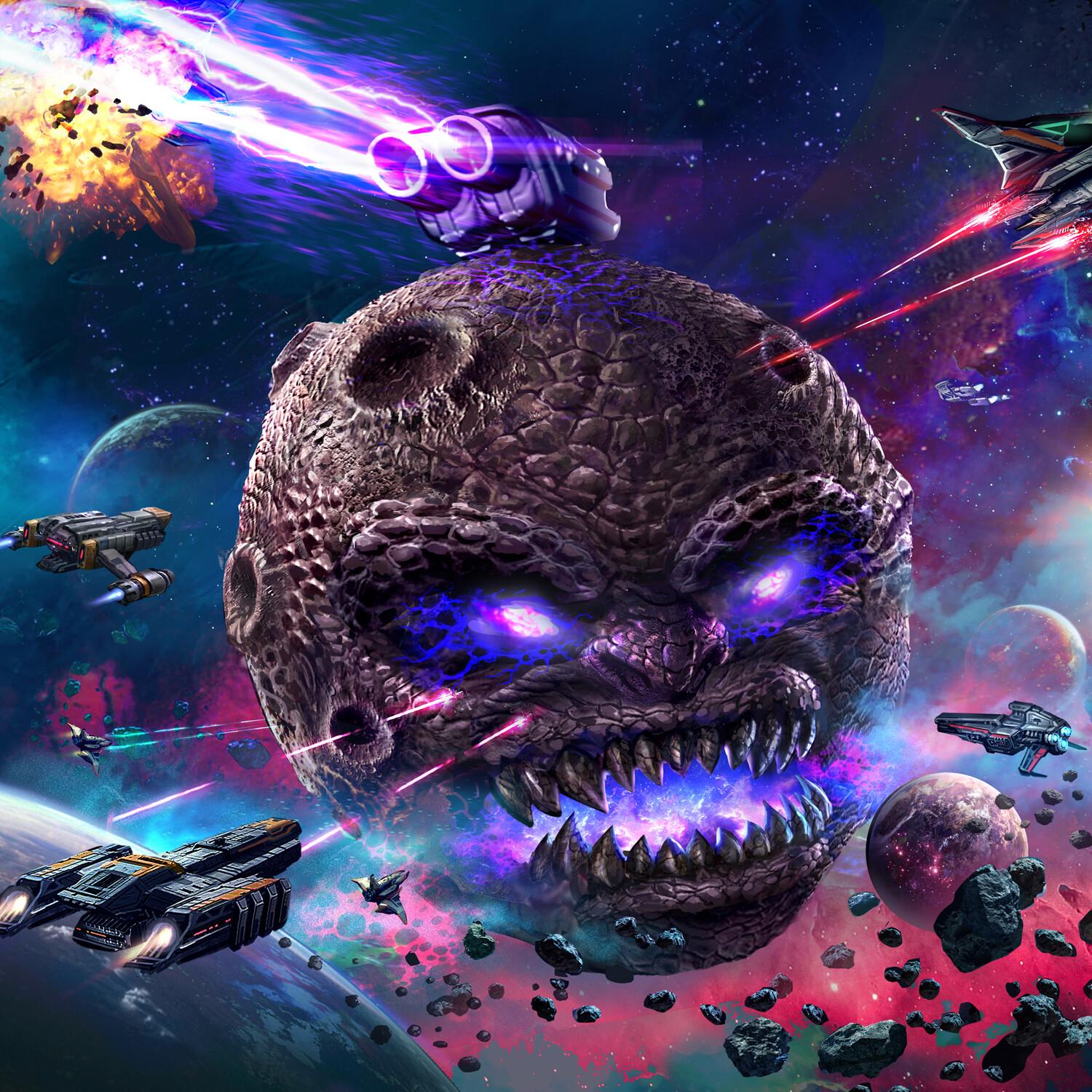
3. Epic Cinematic Illustration: Drama at Maximum Scale
Some board game artwork wants to make your jaw drop. Epic cinematic illustration captures entire battles, world-altering events, and confrontations between titanic forces, all on a single canvas.
This is the art style you find on box covers, rulebook spreads, and Kickstarter campaign pages. It communicates scale, urgency, and spectacle, making a potential buyer feel the stakes before they even know the rules.
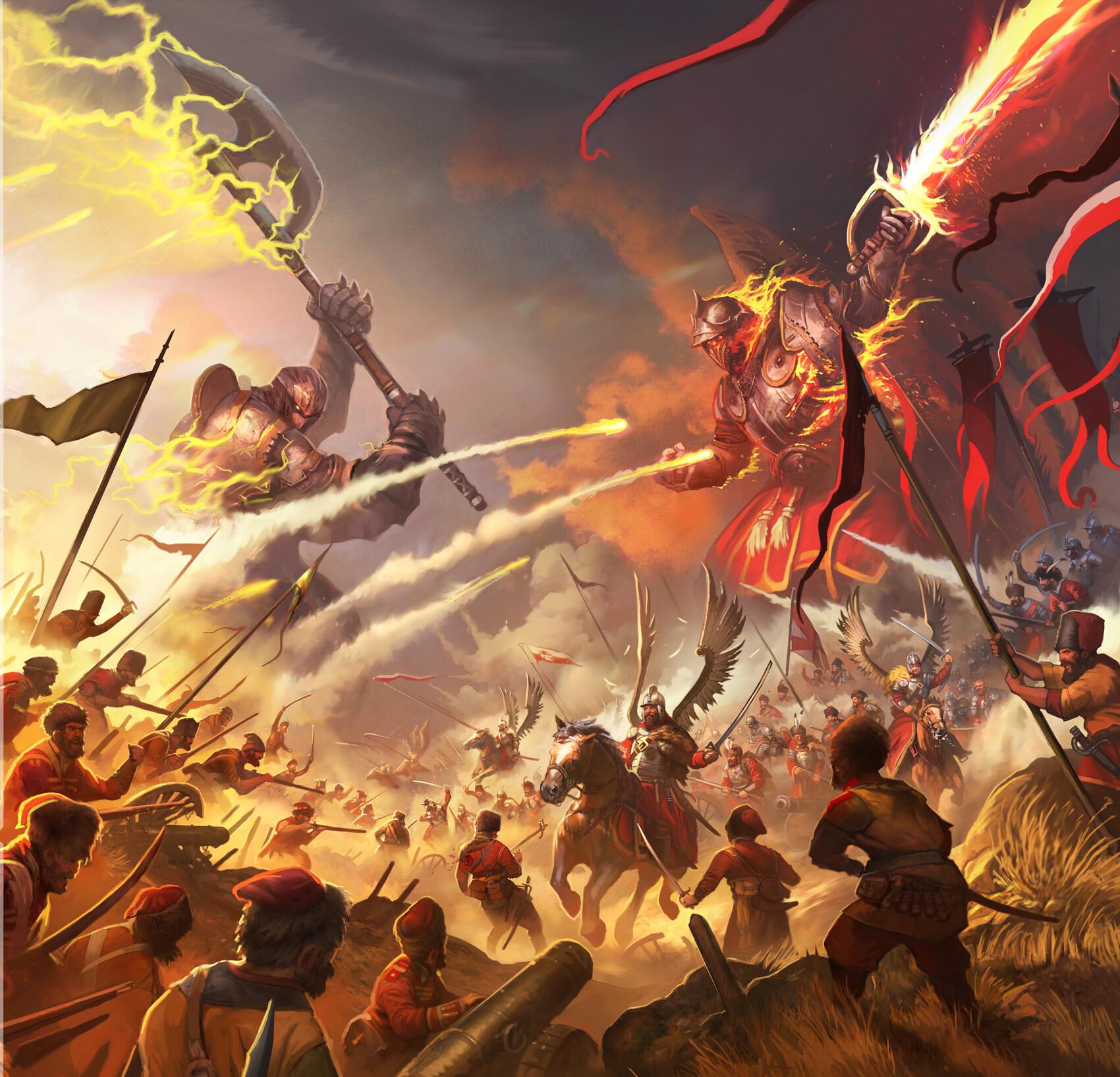
The battle scene above is perhaps the most arresting example: two enormous armoured warriors face off above a sprawling battlefield. One wields a lightning-charged axe, the other a flaming bow, and below them hundreds of soldiers clash in dust and smoke. Every compositional choice, the opposing diagonals, the warm chaos of the foreground, the darkening sky, builds toward overwhelming conflict.
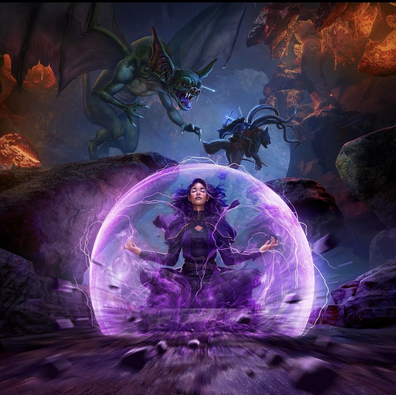
The purple-shield mage takes a different emotional angle. A young woman kneels at the centre of a glowing violet energy field, eyes closed, while a snarling dragon and a tentacled creature lunge from above. Her stillness against their violence is more dramatic than any action pose could be. This is cinematic illustration deploying restraint as a power move.
Why it works: Cinematic board game artwork sells the dream before the game does. It answers “why should I spend £70 on this?” with a single picture.
Best for: Epic fantasy games, war games, adventure dungeon crawlers, Kickstarter big-box games, collector’s items.
What it communicates: “This is an event, not just a game.”
4. Vibrant Cartoon Art: The Style That Welcomes Everyone
Not every board game is trying to summon existential dread. Some games want to make you laugh. Some want to make you feel like you’re eight years old again and the world is endlessly playable. Vibrant cartoon art is the style that unlocks that feeling and it’s far more strategically powerful than people give it credit for.
Cartoon-style board game artwork uses exaggerated proportions, saturated colours, clean outlines, and expressive character designs to communicate accessibility. It tells the player: this is fun. You’re allowed to enjoy this.
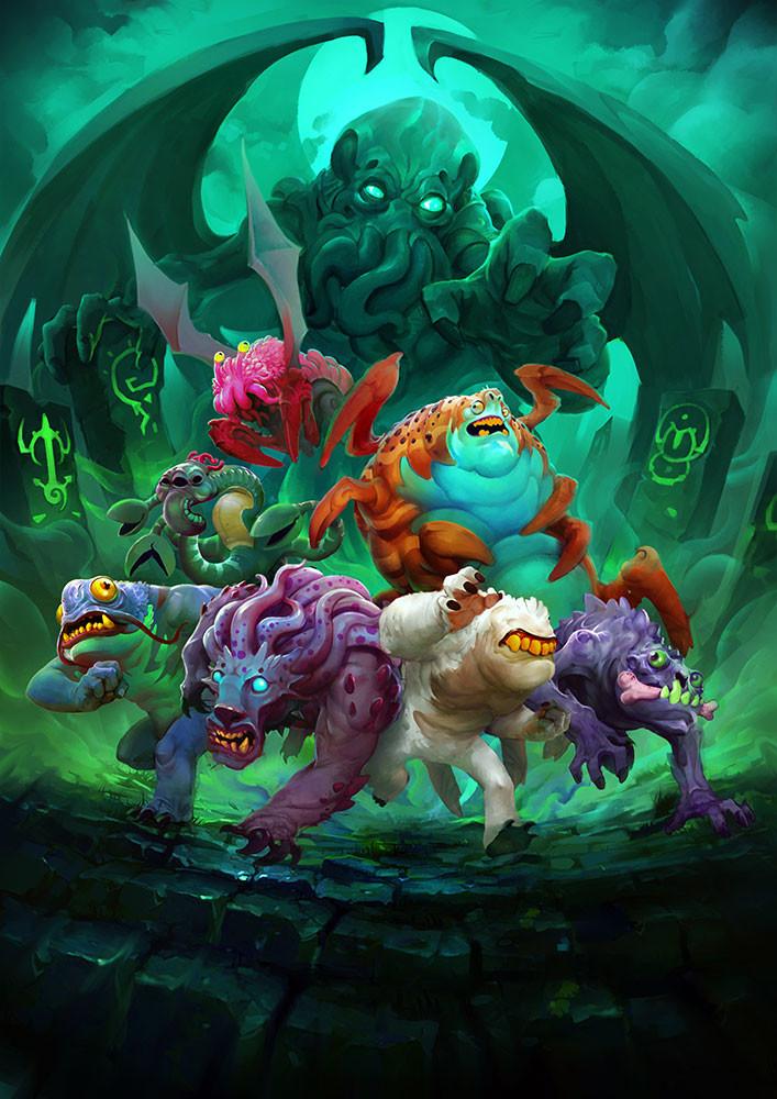
The Lovecraftian monster gang above is a perfect example, creatures from cosmic horror mythology rendered in cheerful, rounded cartoon form. A fluffy white bear-creature, a purple tentacle blob, a crab-thing with an orange shell, a tiny pink eyeball on legs, all charging toward the viewer beneath an enormous Cthulhu figure. Taking something scary and making it delightful is a signature move of great cartoon board game art.
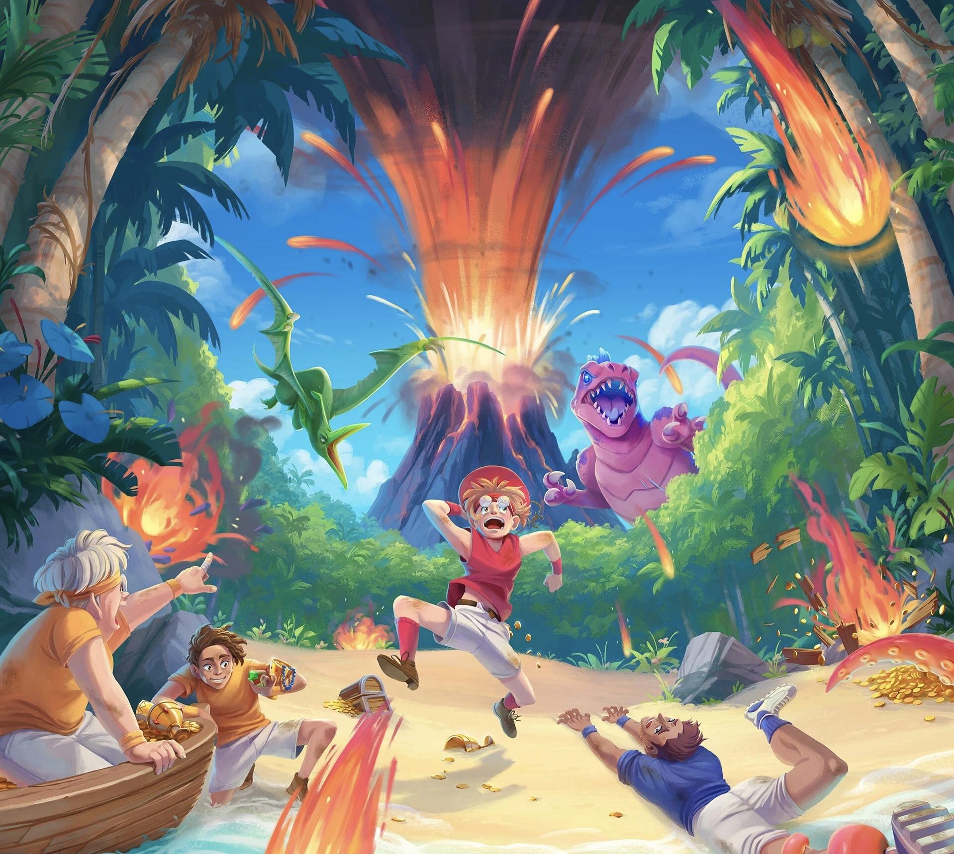
The dinosaur island scene applies the same principle to adventure: kids fleeing a volcano, treasure chests tipping over, meteors streaking, a bright-eyed purple dinosaur giving chase. Every disaster feels like an exciting problem.
Why it works: Cartoon board game artwork lowers the barrier to entry. It says the game won’t be intimidating, overly complex, or gatekept.
Best for: Family games, party games, children’s games, light-to-mid-weight euro games, casual card games.
What it communicates: “This game is for everyone, and it’s going to make you smile.”
5. Character-Driven Narrative Art: A Single Image, a Whole Story
There’s a category of board game artwork whose primary goal isn’t to showcase a style. Its goal is to make you feel something. Character-driven narrative art uses composition, lighting, and emotional tension to tell a story in a single frame, and when it works, it’s the most powerful kind of art in the entire medium.
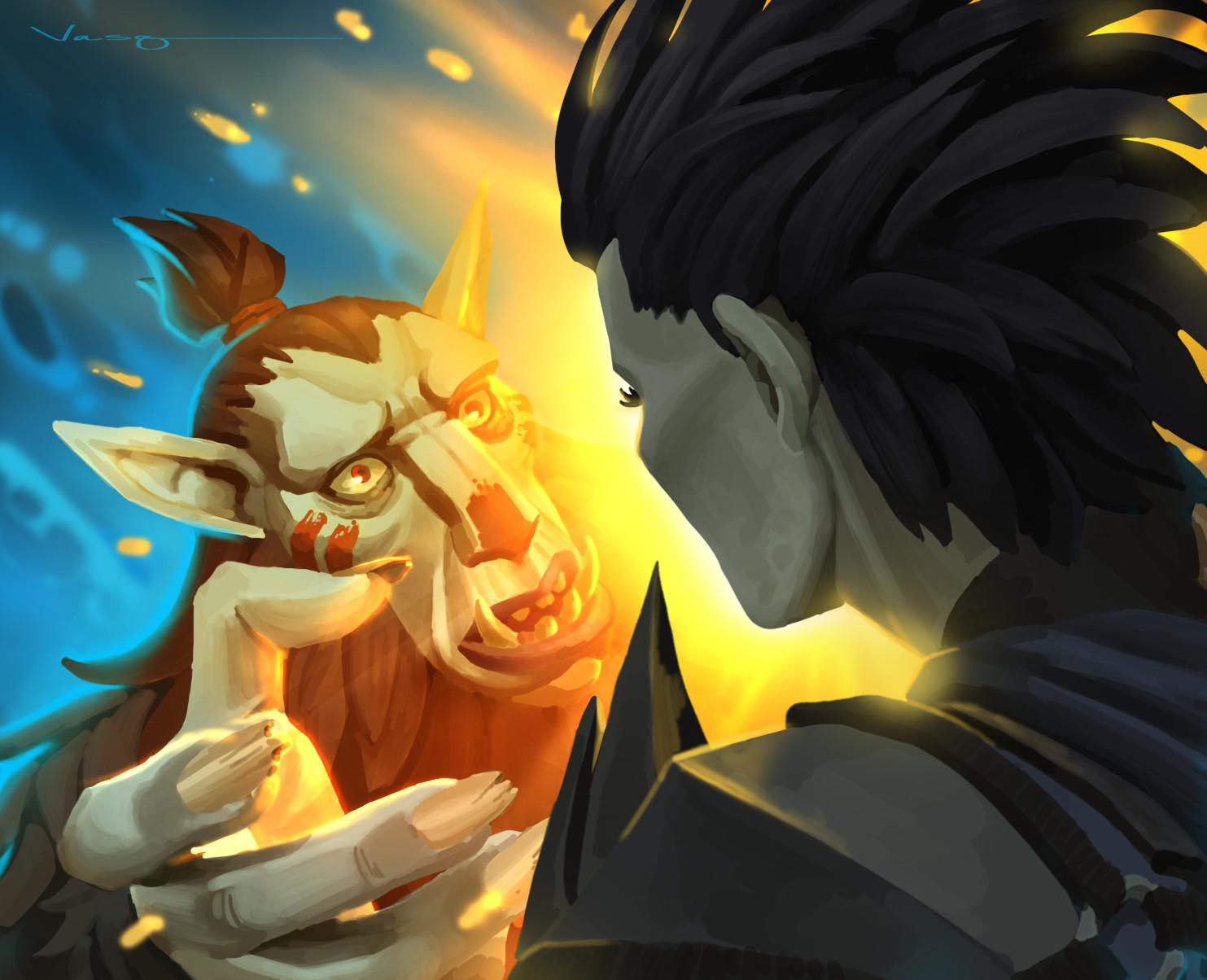
The goblin confrontation above stops you in your tracks. A small goblin-like creature held up close, face-to-face with a huge shadowed figure. The goblin glows with warm gold fire; the larger figure is cold and dark. Their noses are almost touching. Is it confrontation? Recognition? Fear? Love? The painting refuses to tell you, and that ambiguity is the entire emotional payload of the piece.
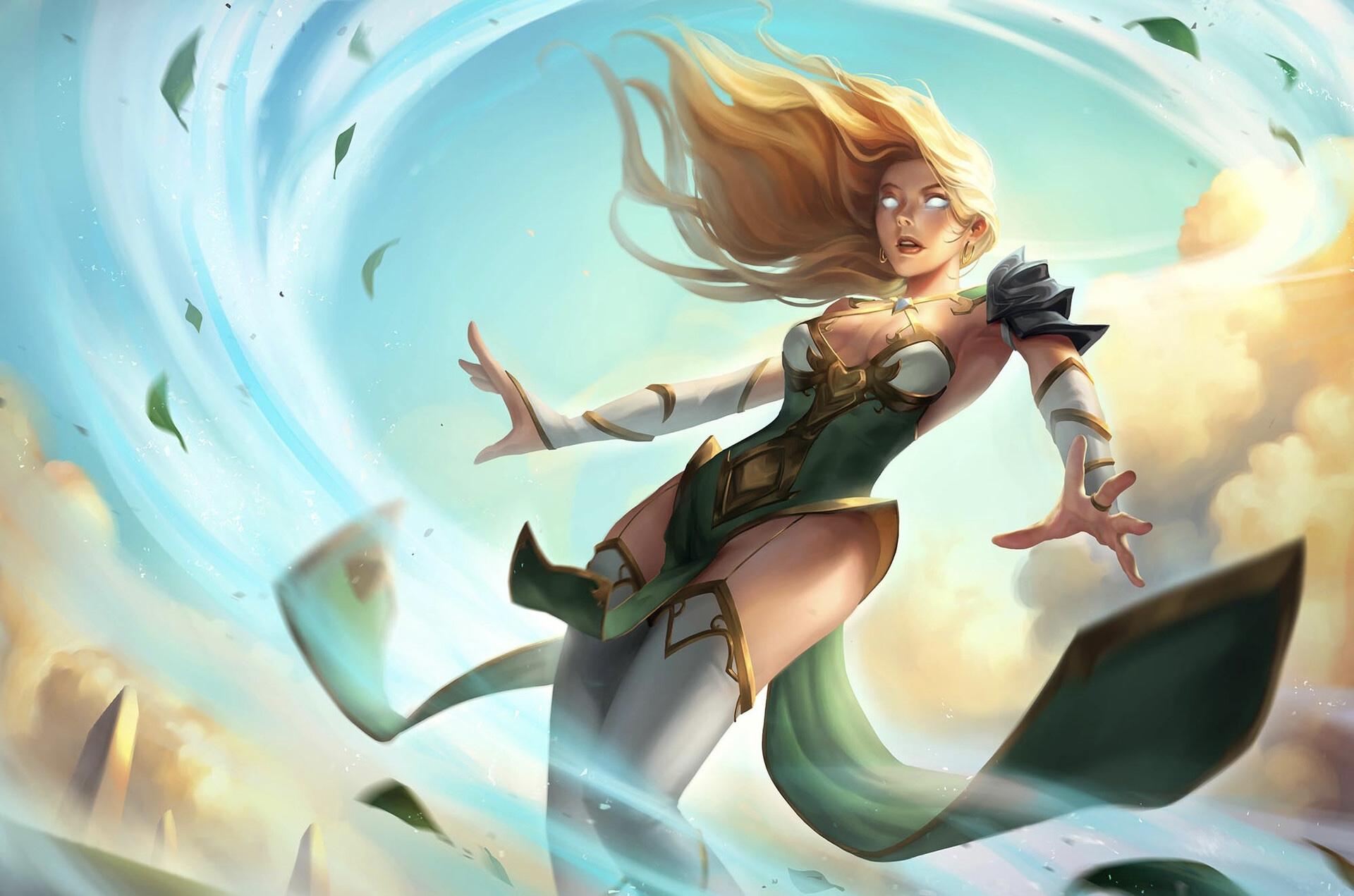
The wind mage levitating in a vortex of leaves and light achieves its narrative through movement and expression. Her mouth slightly open, caught mid-gasp. Something has surprised her. You want to know what it is.
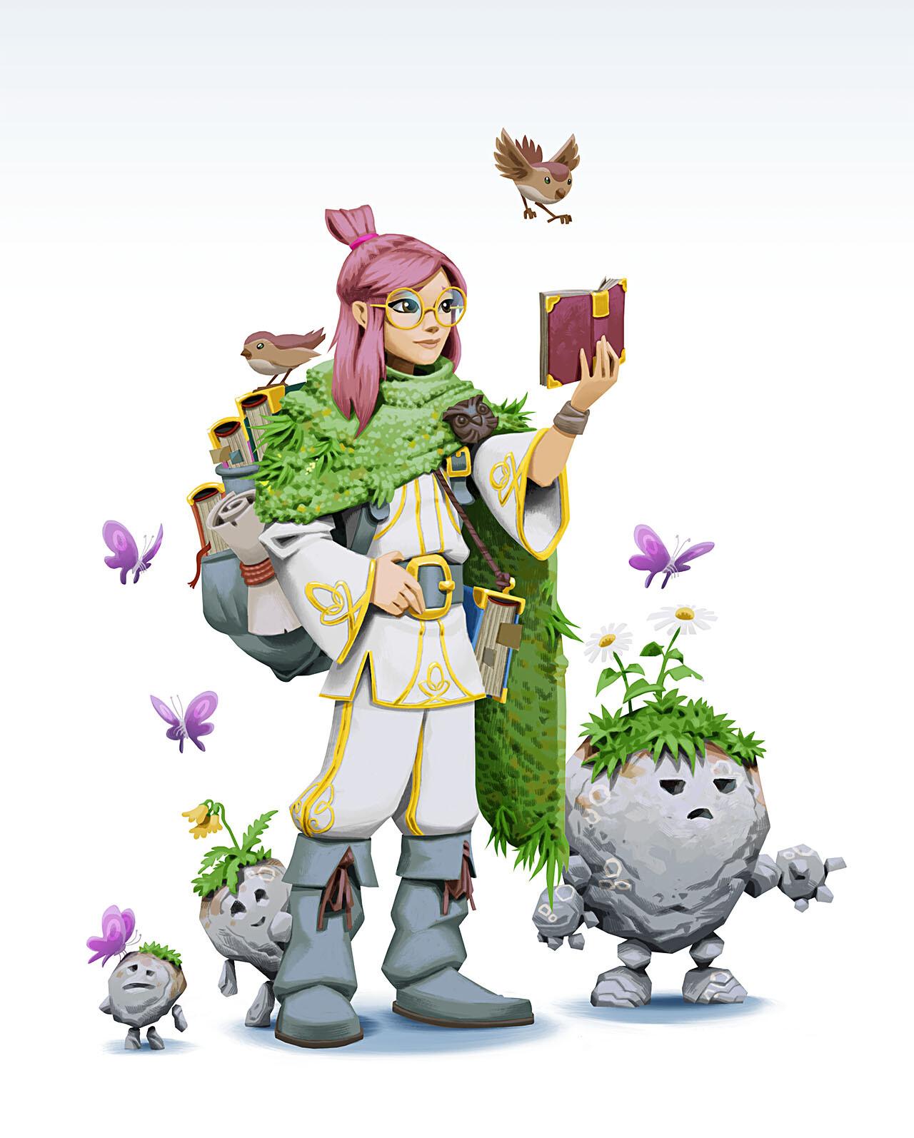
The pink-haired scholar surrounded by small rock-golems takes a quieter, warmer approach. One of the golems reaches up toward her with a tiny stone hand. The narrative is entirely emotional, there’s care here, and wonder, and the beginning of a relationship between a person and a magical world. It makes you want to protect her.
Why it works: Narrative art creates emotional investment before the game has even started. Players who feel something before the first turn play harder, care more, and remember the experience longer.
Best for: Story-rich games, RPG hybrids, adventure games, games where character backstory matters.
What it communicates: “This world has stories we haven’t told you yet, and you’re going to want to find out.”
6. Anime & Action Art: High-Energy Showdowns for High-Energy Games
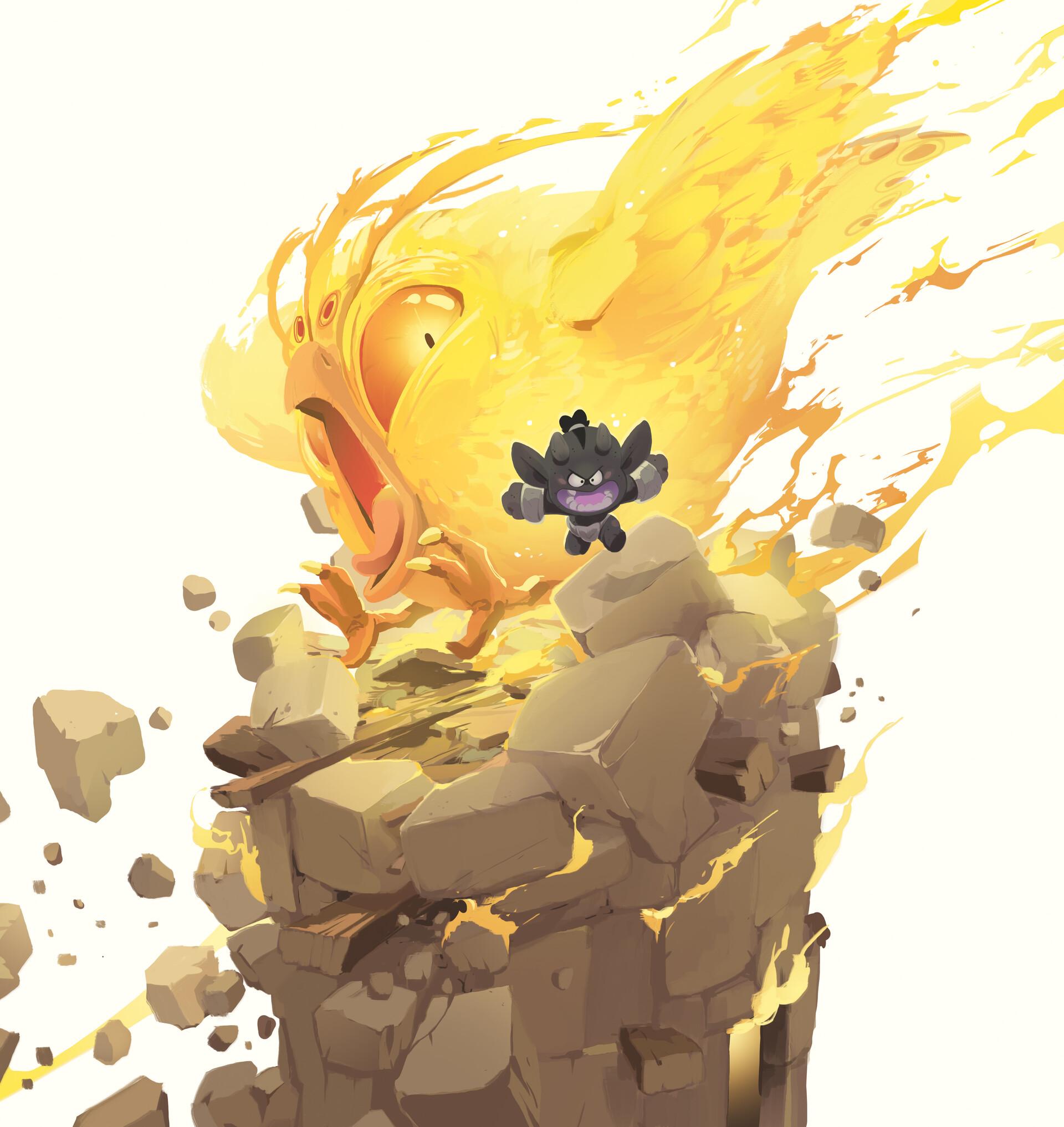
The final major style in board game artwork is borrowed directly from anime, MOBA games, and Japanese card game culture, and it brings with it an unmatched sense of kinetic energy. Art designed for speed, power, and the feeling of a decisive moment caught at its absolute peak.
The defining characteristics: sharp dynamic poses, heavy contrast between light and dark, weapon and magic effects rendered with luminous intensity, and a figure that feels like it’s about to destroy something. It’s the visual language of games that reward aggression and quick decision-making.
The firebird confrontation above is the clearest example, a small dark creature facing down an enormous golden firebird, both frozen on a crumbling stone pillar, wings and fire exploding into white negative space. The minimalist background throws all the drama onto the characters. Maximum drama, zero waste.
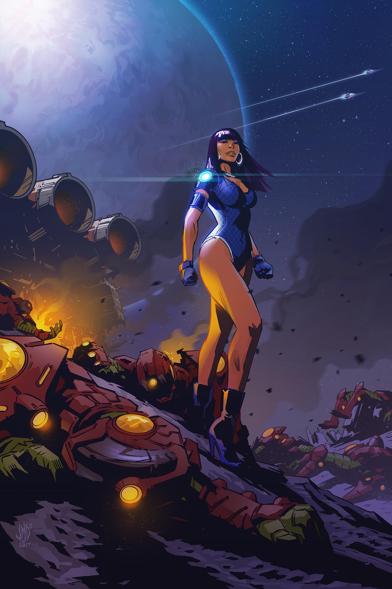
The space warrior bridges concept art and action art. Her stance is magical, but the glowing background and the runic energy pulsing at the background create the overwhelming sense that she’s a fraction of a second away from devastating motion.
Why it works: Action-style board game artwork speaks directly to the thrill of the decisive move, the satisfaction of the perfectly-timed strike.
Best for: Card battle games, competitive dueling games, fast-paced dungeon crawlers, PvP mechanics.
What it communicates: “Come to win. Bring your best.”
Choosing the Right Board Game Artwork Style: A Final Word
Style is never neutral. Every artistic decision is a message to your audience about what kind of experience they’re about to have, and the games that endure are the ones where the art and the game design are in perfect conversation.
Every style in this guide is something we work in. We’ve built these worlds. We know what makes them work. And we can help you build yours.
If you’re ready to create board game artwork that makes someone pick up your box and say “I need to know what’s inside this” let’s talk .
Reach out to us today so that we can design unforgettable board game artwork together.